Canopy Mobile Site
Summary:
Canopy is an online education platform that equips aspiring stock traders with the right tools to enable them to make smart investments and to communicate with professionals about their trading strategies. Our team created an initial design for the learning component of Canopy, which was supported by user research and testing.
My Role: Product Designer
Goal: Design a mobile optimized website template for the learning component of Canopy
The project was broken up into 4 phases: User Research, Ideation, Prototype Development, and Validation

Phase I: User Research
In Phase I, I did 2 of the 8 total interviews of potential users within Canopy’s target demographic. Each interview was 30 mins long and consisted of questions relevant to online learning, finance, and learning habits. It also incorporated a short key terms circle quiz to gage finance knowledge level of the participant.
The main takeaways we got from the research were:
- Short, bite-sized material for learning
- Interactivity within the lesson (pictures, videos, quizzes)
- Guideline/structure to learning
- Unsure what level they belong to (beginner/expert)

Phase II: Ideation
Phase II consisted of brainstorming, narrowing in on main concepts, a few design sprints, and creating lo-fi wireframes.
For the brainstorm, we turned to similar mobile sites and applications for inspiration. We then narrowed in on our top 2 concepts to build out, creating a roadmap and designing short lessons.


We used the GV Design Sprint Crazy 8's exercise to generate our initial ideas for these concepts during which you generate 8 sketches in 5 minutes. This method worked well for us to diverge and explore multiple concepts early in the brainstorming process.
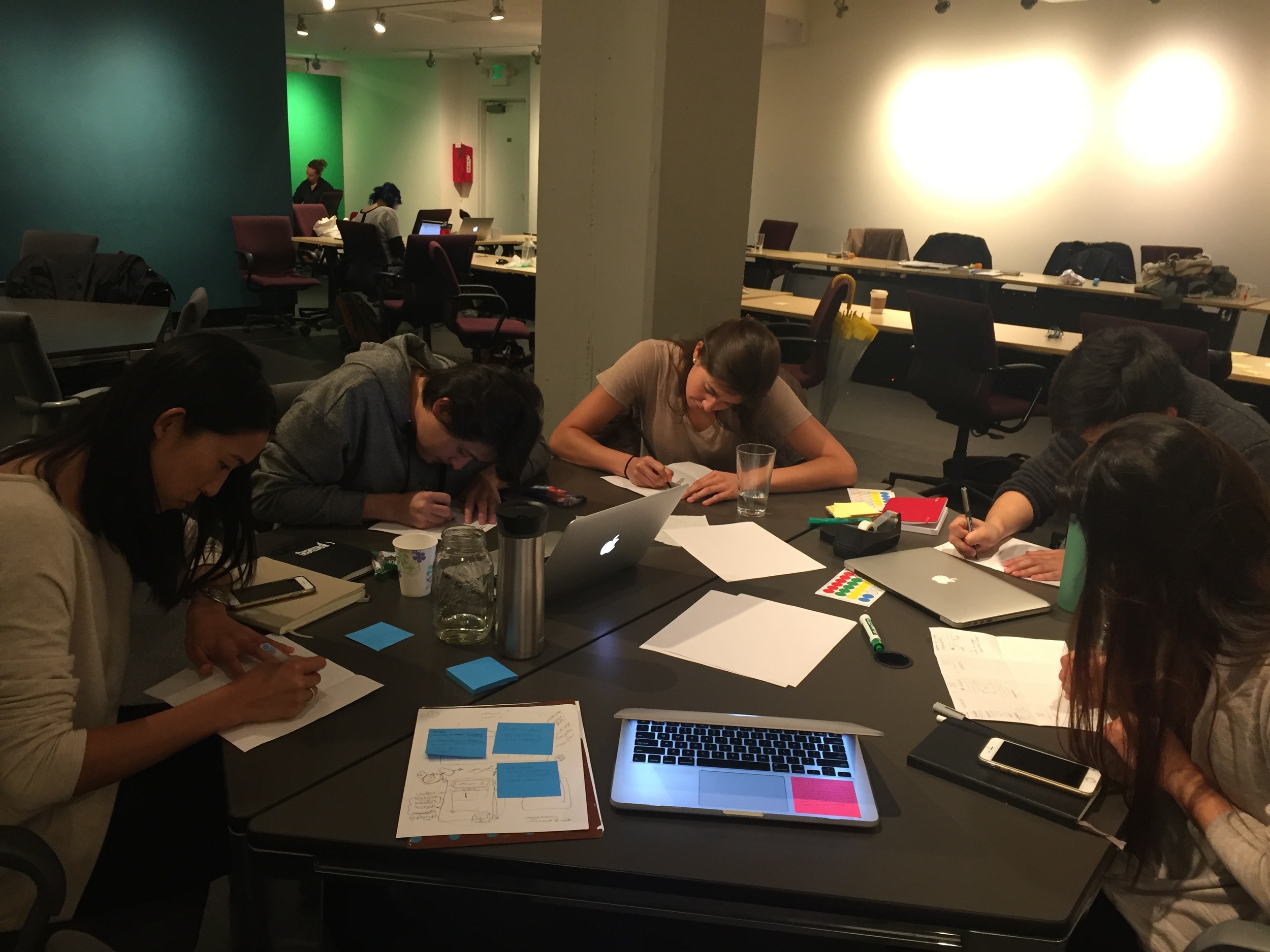

Crazy 8's for Roadmap Layout
Crazy 8's for Lesson Layout
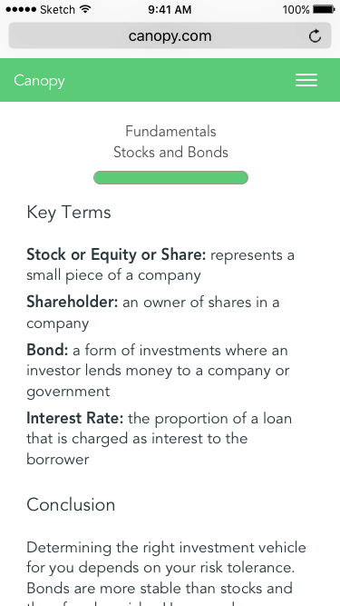
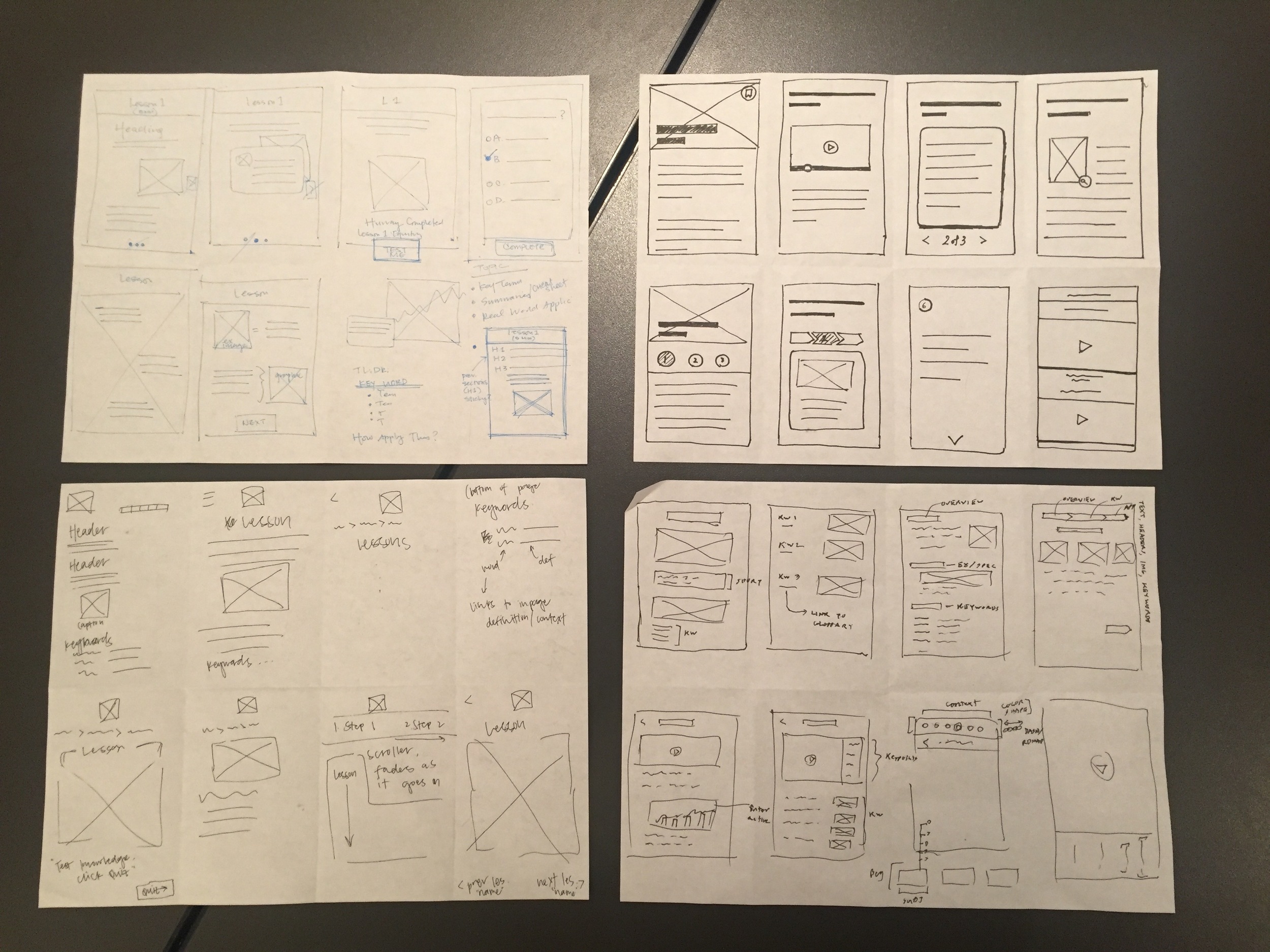
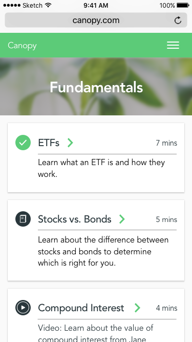
We then split the team and built out lo-fi wireframes for each part of this site. I worked on the lessons side of the website. The lo-fis were reviewed together as a team and presented to the client for feedback. From this process, for the Roadmap, we decided to go with a Card UI, show progress for each course, and have icons for each type of content. For the Lessons, we converged on the idea of dividing the lesson into small pieces, incorporating quiz questions, and some sort of lesson summary.
Roadmap Layout Lo-fi Mockups
Lesson Lo-fi Mockups


Phase III: Prototype Development
Phase III was the design refinement portion of the process. We created mid-fi mockups, made visual design choices, defined a task flow, built a prototype, and did a round of usability testing.
Below you can see the task flow incorporating the two elements, Roadmap and Lessons.

For the first round of usability testing, we had 6 people within Canopy’s demographic run through the Pixate prototype to get initial feedback on our work.
Some of the main insights were that people did not understand the locked lessons or the concept of the cheat sheet and were slightly confused by the lesson architecture. There were many positive responses to the progress bar with the lesson.


Phase IV: Validation
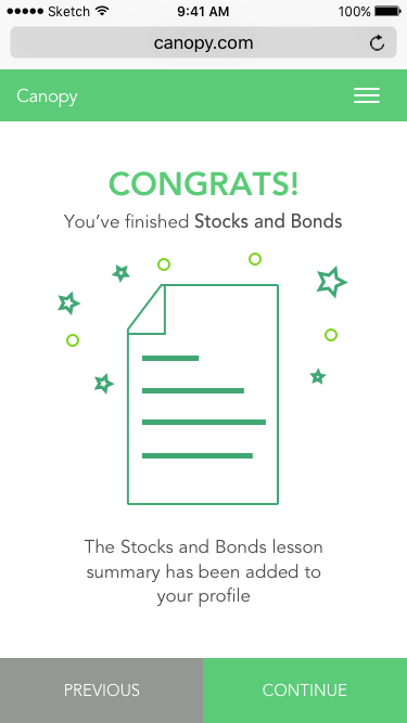
In Phase IV, we created hi-fi mockups that incorporated the insights from Phase III’s usability testing, did a second round of testing, iterated again based off the new responses, and then created a final version (below).


Prototype:
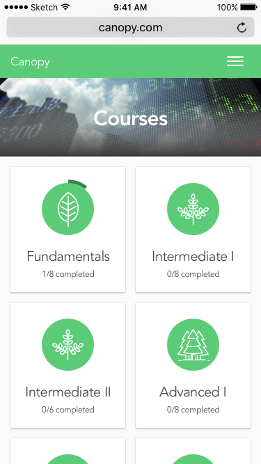
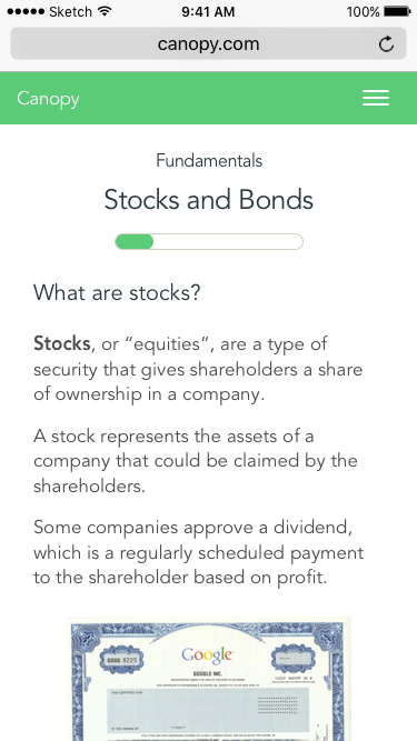
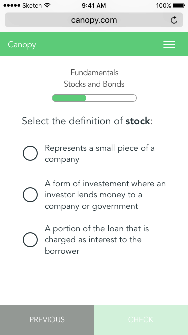
The following steps are shown:
1. Select Course
2. Scroll through Lessons page
3. Select Stocks & Bonds lesson
4. Start working through content and quizzes
Once the roadmap and lesson base were established, we explored some more features of the Canopy environment to complete the experience. The team set up the structure for the desktop version of the site, built out the site navigation, came up with some initial ideas for new pages such as Profile, worked on distinguishing premium content in different ways, identified a more extensive color palette, and found some appropriate icon sets to work off of.
Conclusion:
The project provided Canopy with a solid foundation for the development of their website. The company has implemented several of these changes already and will continue to build out the designs.
Team Members