Landing Page Redesign
My Role: UX Designer
Summary: I worked on redesigning Soma Water's Carafe promotional landing page with a team of four other designers. We also collaborated with the growth team to ensure that the right key metrics were being accounted for.
The problem with the existing page was that people were not understanding what the offer was and therefore not converting. The redesign improved user comprehension rates from 4/10 to 10/10.
Project Goals:
Increase conversion and comprehension of the Carafe landing page
Increase email subscribers for future product offerings.
Demographic Data & Personas:
From the demographic data provided to us by Soma Water, we created the two personas (Sarah and James) below to help us keep these insights in mind when designing for their user base.


Personas by Cally Dai
Comprehension Test of Existing Page:

The team ran comprehension testing on 10 users to evaluate the current landing page. The biggest problem we found was that 6/10 users did not actually understand the offer that Soma Water was presenting. This was a major pain point that we made sure to improve upon in our design with a more clear "How it Works" section.
The team synthesized the information in a session together by mapping out the interview results on post-its and grouping together the relevant insights. This revealed that much of the information on the current was not actually very helpful for the users. The chart below shows an overview of the findings.


Hypothesis:
If we make the offer and unique value proposition clear on the landing page, then we can decrease friction on cart and checkout pages. This will lead to an increase in comprehension and conversion.
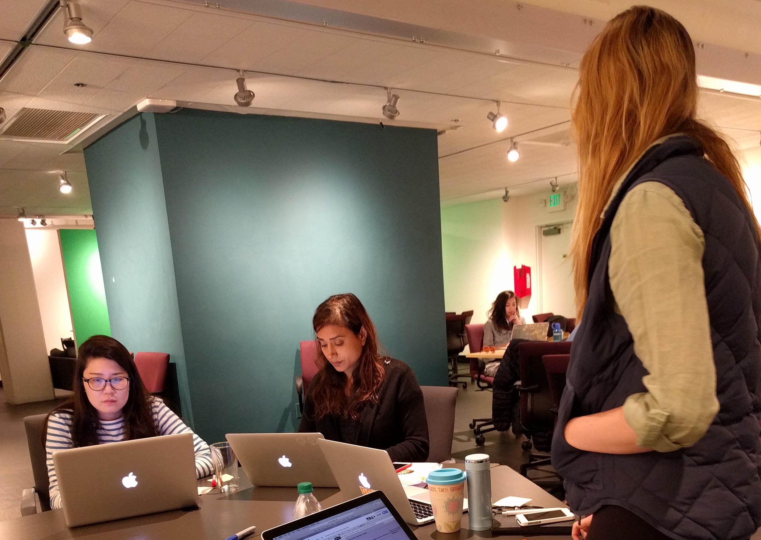
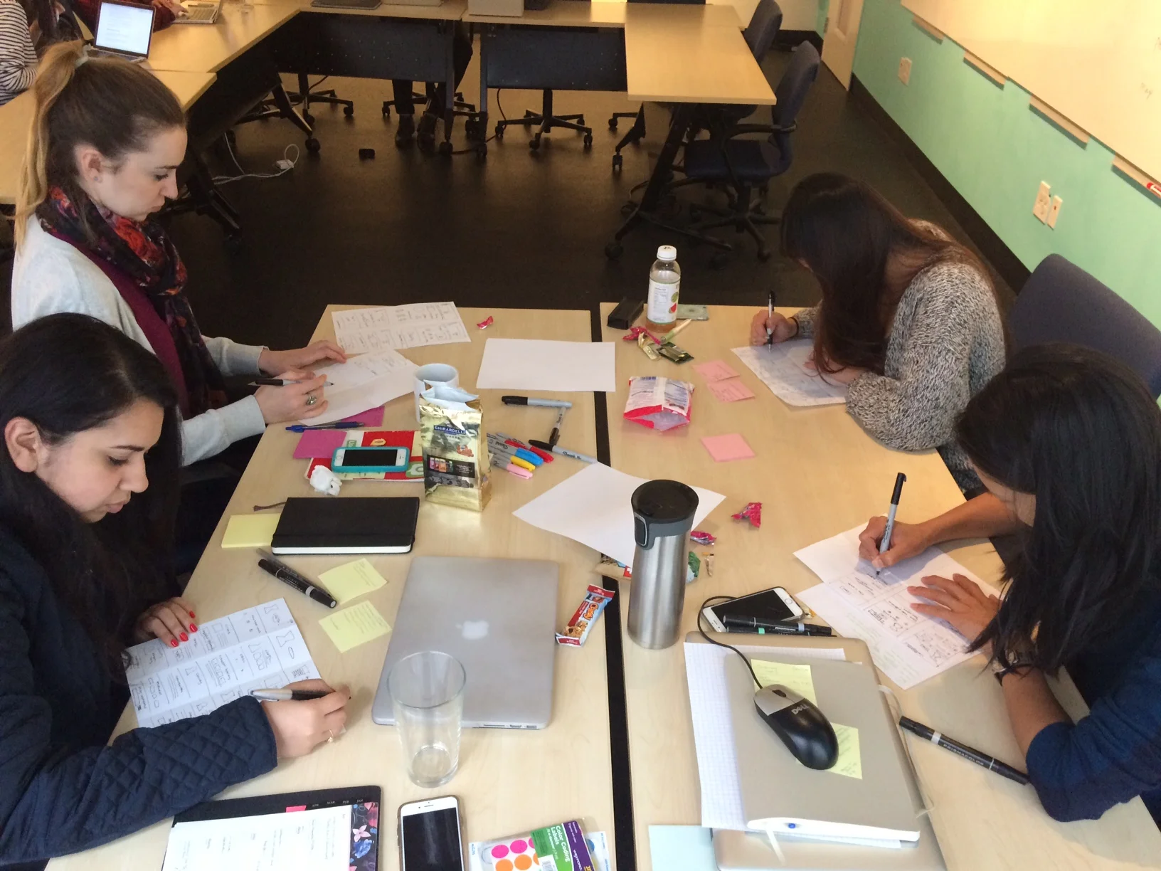
Design Sprint:
The team did a GV inspired design sprint to generate some ideas around how to rework the landing page based off the user feedback we received and the direction from growth regarding the value propositions. The goal of this session was to experiment with different layout styles and then converge on a common page structure to start designing.
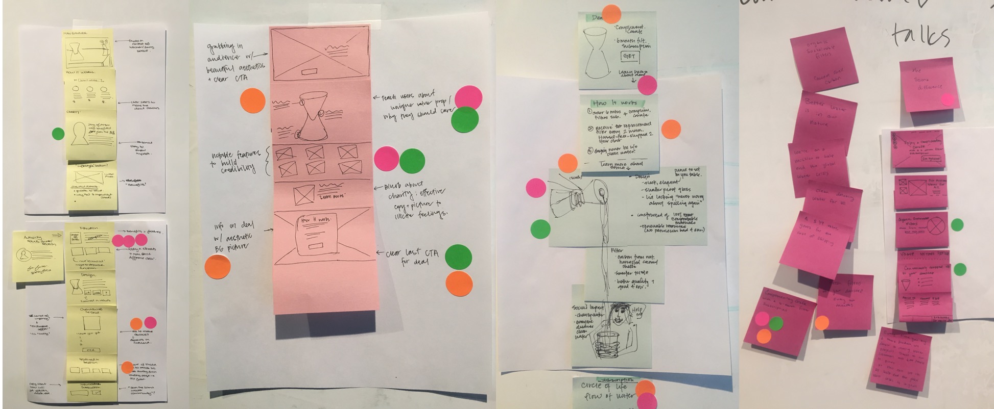
Rapid Iterations:
I went through several iterations to try to improve upon these metrics. Throughout the iterations, I varied the hero image, supporting images, content structure, length of sections, and page organization.
From the team's feedback I concluded that the blue images were too sterile/cold and opted for a warmer set of photographs for the page. After trying some longer versions of the pages initially, we found that a shorter site was a better approach for a landing page and that the extra text may be more appropriate elsewhere on the site.
The final page I settled on provided clear value propositions, inviting images, and a shorter reading length.
Final Design:
My task was to work off of the user feedback and create the final design for the landing page, which you can see below.

Final Usability Test:
We saw improvement in all areas with the final design we presented to users. The biggest win was that 10/10 users now understood Soma Water's offer. The "How It Works" section and the final "Claim Your Carafe" were particularly helpful in driving this change.
Below are the main changes we made from the original:
Reworked "How it Works" section into an icon based visual
Changed wording from "free" to "complementary"
Changed "Filters by Mail" to "Subscription" in the navigation menu
Clear and consistent CTAs
Reformatted the "Soma Carafe" summary section to make deal clear

Conclusion:
The redesign was overall successful in changing the metrics we set for ourselves at the start of the project. 10/10 users now understood what the offer was. Focusing in on our four main value propositions also gave the page clear direction and added more context for users about the carafe. Our research and designs were presented to Soma Water and their team is now working to test this design against their current page.